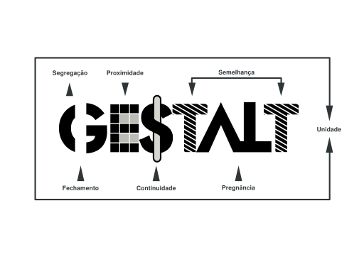
Since their establishment in the 1920s, the Gestalt principles of design have been must know concepts for all aspiring designers. Drawn up by psychologists Max Wertheimer, Kurt Koffka, and Wolfgang Kohler the Gestalt principles reveal how humans organize and perceive visual stimuli. By understanding and utilizing these principles, designers can create visuals that are meaningful and naturally appealing to the human eye. Examples of these principles can be found in many popular logos and brand marks today.
Similarity & Anomaly
The Principle of Similarity & Anomaly can be found in many logos. Through the use of similar shape, size, or color, designers can group elements of a visual together or create an appealing pattern. When the principle of similarity is used, the idea of anomaly can be added onto it. Through anomaly, designers can emphasize or make an element stand out by breaking the similarity rules.
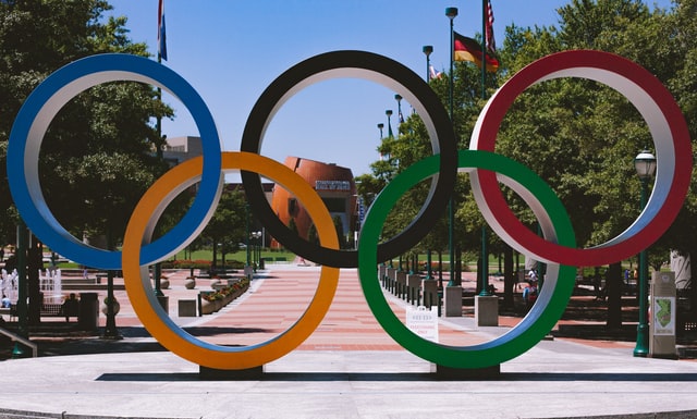
The Olympics logo uses the similarity of the size and the line weight of the rings among other principles to unify the design. Through this similarity of shape all the rings are viewed as one group despite their differences in color. This is appropriate for this logo as the 5 equal rings represent the 5 continents of the world. The similarity of shape in each ring symbolizes how in these games the world stands united on equal ground. The difference in each ring's color shows that we are each different, but because of the similarity in shape, no one color or continent is greater than another.
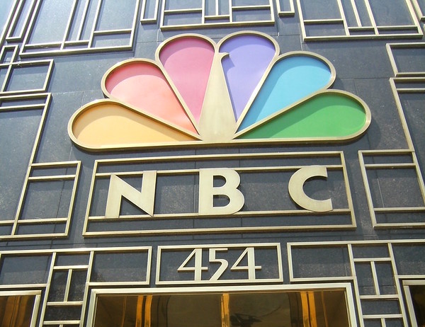
The NBC logo uses similarity and anomaly in its peacock logo. The peacock’s tail displays similarity through its matching shapes and bright colors. The similarity here unites those tail shapes so they are viewed as one cohesive group rather than 6 separate pieces. By breaking the pattern of the tail, the body and head of the peacock is emphasized. Its white value and deviating shape makes it stand out from the tail so it is viewed as its own element. Through similarity and anomaly, this logo can be understood as a peacock.
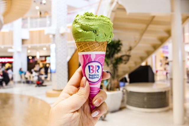
The Baskin Robbins logo uses similarity and anomaly in color. Through this principle Baskin Robbins’ creates its well known ‘hidden message’. The blue color used in the logo’s type is the similar element. The common blue color groups all the words together. The pink color found in the left side of the ‘B’ and the right side of the ‘R’ is the anomaly that breaks that similarity of color. This use of anomaly separates those shapes from the rest of the words and when viewed together the read ‘31’, representative of Baskin Robbins’ 31 flavors.
Continuation
The principle of Continuation outlines the idea of movement in a visual element. Through the placement or the form of visual elements, a designer can use continuation to depict motion or help move the viewer's eye from one element to the next. Visual elements that properly use this principle create a pleasing flow and can guide viewers through the design.
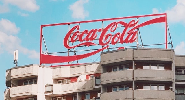
The famous Coca-Cola script font is a great example of continuation. The tails of the ‘C’s guide viewers through the logo. The flowing tails mirror the way the words “Coca-Cola” roll off the tongue. If you take a second to really analyze this logo, you can see how those tais give the logo visual movement from left to right.
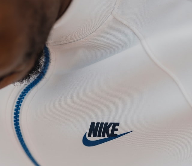
The well-known Nike swoosh displays continuation well. The movement of the check mark logo captures the viewer's eyes and guides our attention toward the Nike wordmark. The italicized font enhances that movement and causes viewers to group the elements together.
The Amazon logo shows continuation through the arrow. This logo uses this arrow to guide the viewer through the logo, as well as add some unity within the design. A few fun things about this logo are that the arrow purposefully starts at the ‘A’ and ends at the ‘Z’ representing that Amazon has everything from ‘A to Z’. The Arrow also looks like a smile to give off a positive, happy emotion.
Closure
Closure is a principle that describes the way the human eye is naturally able to complete incomplete shapes and forms. Our brains are always trying to make meaning out of what we see. Our minds are good at adding in necessary lines and closing open shapes to find meaning. If done properly, viewers can find a figure or symbol out of an arrangement of shapes or lines that individually are incomplete. A design having just enough detail for someone to understand it, yet be abstract and simple enough that the shape or figure isn’t just the literal shape or figure, makes a design stand out and captures a viewer’s attention.
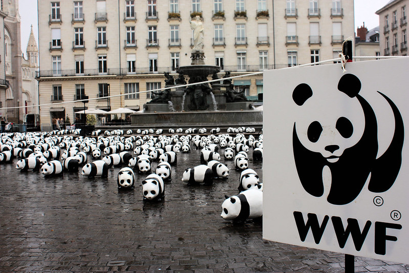
The World Wide Fund for Nature logo is well known for its use of closure. When viewed the shapes depict a panda bear. Because of the use of the principle of closure, viewers can see the panda, despite the panda’s conture being incomplete. The minimal use and the smart placement of shapes makes the logo visually pleasing and detailed just enough to make sense.
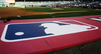
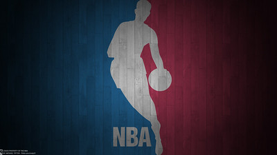
These two logos use closure to create a figure playing the corresponding league’s sport. The blue and red shapes are cut in a way that when viewed together depict the figures. Despite not fully outlined, our human brains can complete the figure that each logo is conveying and understand them. By having to view the shapes together to find the figures the background shapes are deemphasized, becoming a singular piece that surrounds the now emphasized figure.
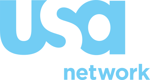
The USA Network logo uses the principle of Closure for the letter ‘S’. The ‘U’ and the ‘A’ have small outlying bits that when viewed together create the ‘S’ in the center. The closure in this is used to unify the logo, since the ‘USA’ letters have to be viewed as one group to be read.
Proximity
The principle of proximity defines how viewers group together elements that are visually close to each other. Through the close proximity of visual elements to one another, separate pieces are viewed together as a group. This can be used to make a larger image or create connectivity between two or more separated shapes.
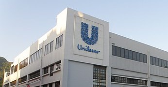
The Unilever logo is a very good example of the principle of proximity. The logo itself is made up of many small images that because of their closeness to one another are visually grouped together to create a larger “U” image. This logo shows how the assortment of depicted things all come together to define their company. Through proximity the individual pieces are united.
The International Business Machines logo uses proximity in their simple, yet bold logo. Through proximity of the white bars, the characters can clearly be read as IBM. This famous logo is unique because of this interesting use of stripes. The stripes are meant to represent speed and vibrancy. The stripes work because their close proximity groups them together in the shape of the letter.
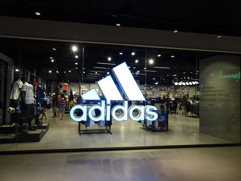
The Adidas logo relies on proximity to unify the three diagonal bars. Each of the black bars in the adidas logo is of different length and the bars do not end on the same plane as one another. What makes this logo work is proximity. Through close placement of each bar to one another, the logo still feels complete and whole. By positioning each bar side by side, the bars feel visually connected.
Figure/Ground
One of the more complicated principles to pull off is Figure/Ground. This principle describes when a design has dual meanings depending on whether the viewer is looking at the positive or negative space. This principle is very interesting as one single design can contain two different figures. Because of how our mind interprets images, viewers see one figure or object at a time. This principle is very interesting to see in designs as the viewer can switch from one interpretation of the design to a completely separate interpretation of the same design.
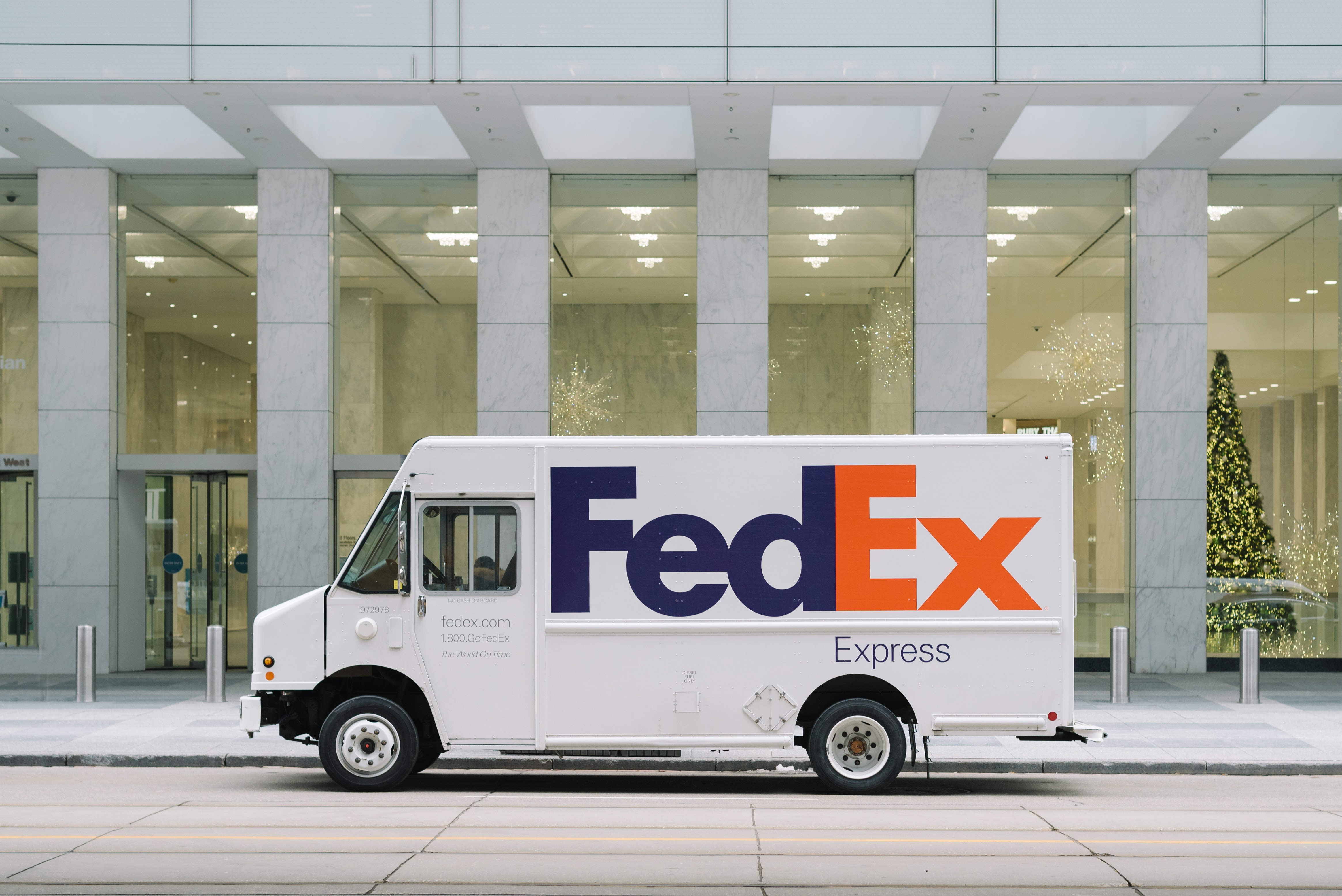
This wouldn’t be a proper logo analysis if the FedEx wasn’t mentioned, so here it is. The FedEx logo is the most popular example of the use of figure/ground in a logo. When the negative space of the ‘E’ and ‘x’ in FedEx is viewed, it creates a white arrow, embodying the shipping company's purpose perfectly. This logo has been frequently recognized and for this very simple yet clever used of figure/ground. The arrow isn’t distracting from the design, but perfectly enhances it, giving meaning to the simple written out wordmark.
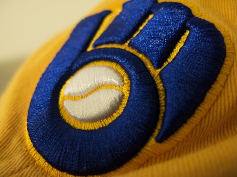
The Milwaukee Brewers logo is another loved logo because of its use of figure/ground. This baseball team logo can be viewed as the team’s initial’s ‘mb’ or as a baseball mitt when looked at as a whole. Each element in this logo is cleverly placed in order for this double meaning to work. The ‘mb’ is perfectly arranged, so that there is no mistake the letters are ‘mb’, but it is also crystal clear the logo depicts a glove.
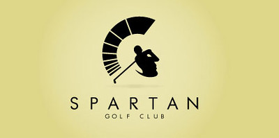
The Spartan Golf Club logo is more known as an example of good figure/ground in design than the actual Spartan Golf Club (I am not sure if it even exists). This logo is also commonly referenced for its brilliant arrangement. The logo can be viewed as a pretty detailed figure of a golfer swinging a golf club, while at the same time being seen as the face and helmet of a Spartan warrior. The design cleverly uses the arms and the gap in the arms of the golfer silhouette to create the nose and eye of the spartan and the golf club trail depicts the plume on top of the helmet. The figure is creatively depicted to also define the jaw and mouth of the face, without sacrificing the clarity of the figure.
Symmetry
The principle of symmetry refers to visual balance of a design through the mirroring of an image. Visually symmetry is pleasing to look at as it is seen as completeness or balanced. Symmetrical designs do not have unbalanced elements that shift our focus away from the design as a whole. While there is nothing wrong with asymmetrical designs, symmetrical pieces tend to convey perfection rather than “human imperfection”.
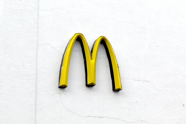
McDonalds’ famous golden arches are a good example of symmetry. The arches of the ‘M’ are mirror images of each other. The symmetry in this design makes it feel balanced with no distracting elements on either side taking away from it. While a very simple logo, its symmetry makes it feel complete.
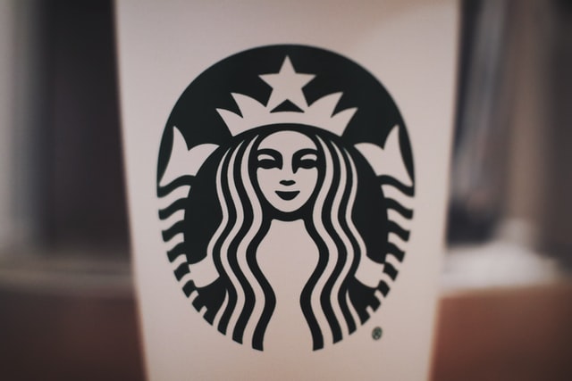
The Starbucks mermaid logo displays symmetry in the figure. The choice to make the mermaid symmetrical helps the logo be centrally focused. If the logo were not symmetrical the implied movement of the logo may distract from it. The symmetrical logo is also great to put on a coffee cup, since if at an odd angle of viewing, where some of the logo is hidden due to the cup’s form, the logo still feels complete when someone looks at it.
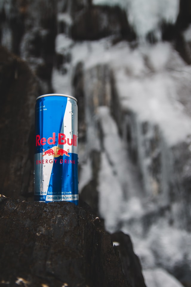
The Red Bull logo uses symmetry to counter the very strong implied movement of the bulls. The image of the bull is very head strong and its charging motion creates a lot of visual motion. By adding a second mirrored bull to their logo, the movement is all heading toward the center instead of away from the logo. The symmetry balances the otherwise very unbalanced bull image.
Citations
www.facebook.com/stuartlcrawford. "The Gestalt Principles - Theory Of Good Design Psychology." Inkbot Design. February 19, 2021. Accessed March 30, 2021. https://inkbotdesign.com/gestalt-principles/.
Lile, Samantha. "How to Apply Gestalt Design Principles to Your Visual Content for Maximum Impact." Visme Blog. September 27, 2017. Accessed March 30, 2021. https://visme.co/blog/gestalt-design-principles/.
 HOME
TOPICS
FEATURED
HOME
TOPICS
FEATURED

